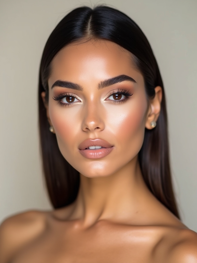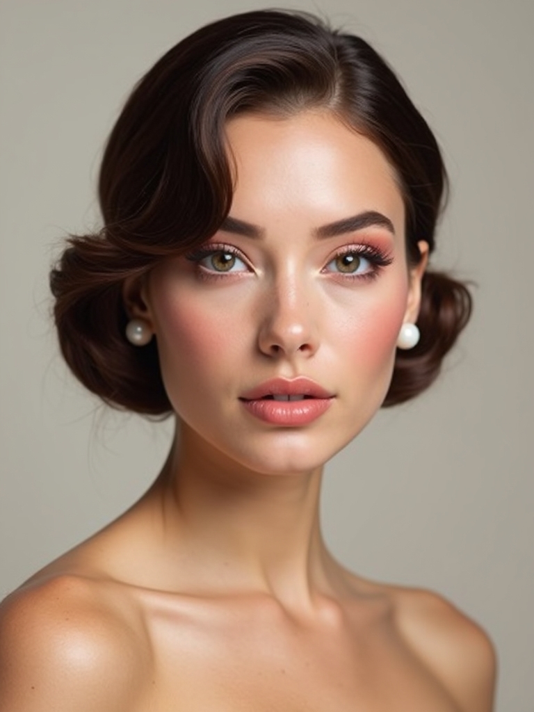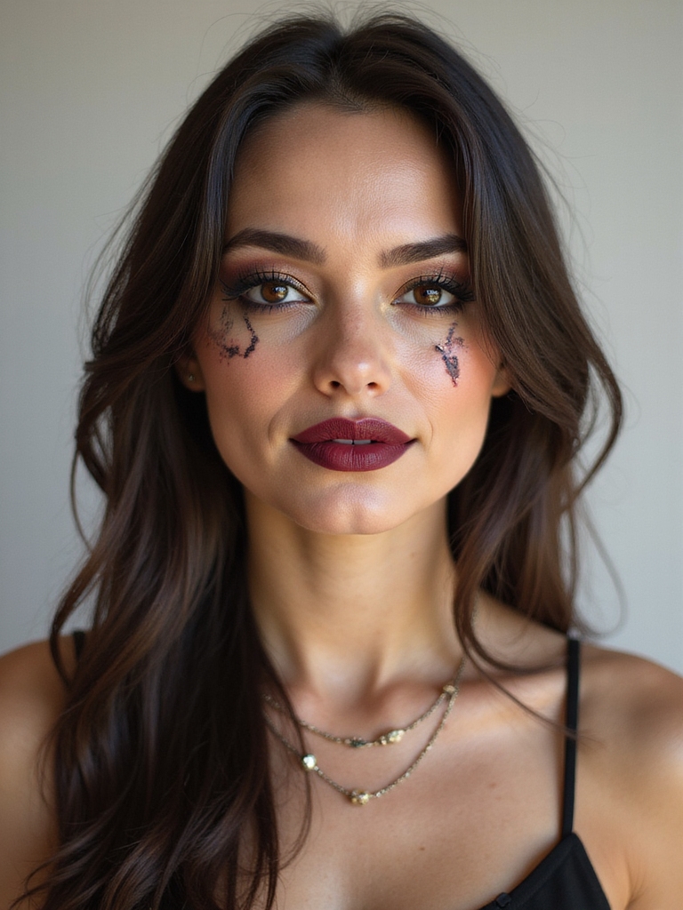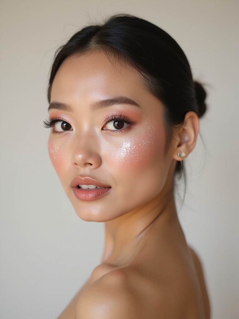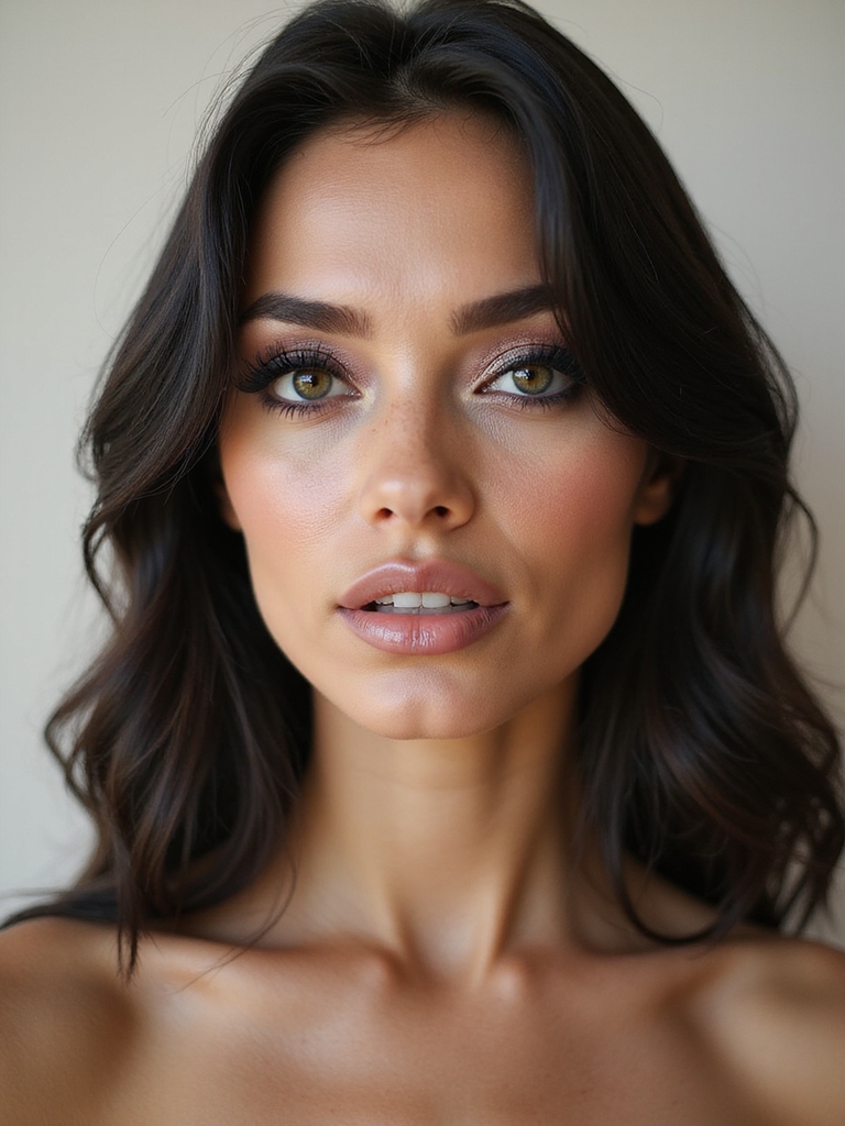
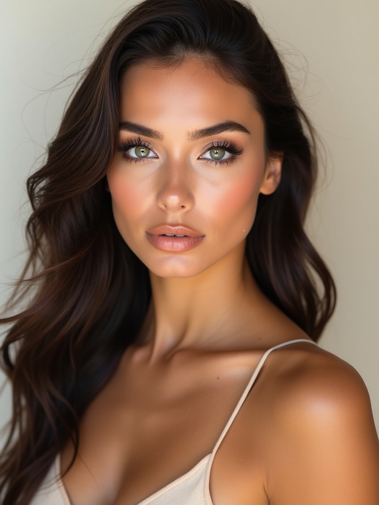
There is a moment when you finish a high-contrast look, a jet wing against bare skin, a neon lid over a nude mouth, and the face in the mirror suddenly looks photographed rather than just made up. That snap of dark-against-light or bright-against-bare is what gives a face its drama, and once you see how it works, you start spotting it everywhere.
High contrast is less a single look than a principle: pair something bold with something quiet so each one pushes the other louder. Below are fifteen ways to put it to work, from sculpted scarlet to a gilded inner corner, each with the steps, who it tends to flatter, and how to keep it sharp. Some are everyday-wearable, some are full editorial, and all of them photograph.
The Quick Version
What actually makes a look high contrast? Pairing extremes: dark against pale, bright against bare, matte against gloss. One element shouts while everything around it stays quiet, so the bold part comes across even bolder.
Does high contrast suit every face? Yes, but the levers change. Naturally high-contrast features (deep eyes, fair skin, or dark brows on any tone) take bold pairings easily; softer coloring can build contrast with placement and a defined liner or lip, a notch up from medium contrast makeup.
How do I keep it from looking harsh? Blend the edges that should be soft, set bold color so it stays crisp, and keep the rest of the face truly quiet. Harshness usually comes from competing focal points, not from the contrast itself.
Sharp Jet-Black Winged Liner
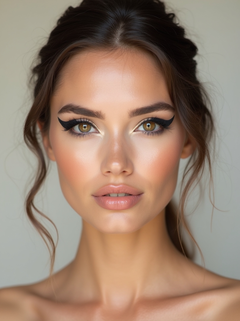
The cleanest high-contrast look there is: a jet-black wing on an otherwise bare, glowing face. With nothing else competing, the liner becomes the entire statement, which is why it looks so graphic in photos. The whole look lives on the crispness of that one line.
Three things keep the wing sharp:
- Use a felt-tip liquid liner and the dot method: mark the tip and angle before connecting, so both eyes match.
- Keep the skin luminous but quiet, just skin tint and a wash of cream blush, so the black pops.
- Set the wing with a touch of matching black shadow pressed over the top so it does not transfer or fade.
Electric Neon Lids With Nude Lips
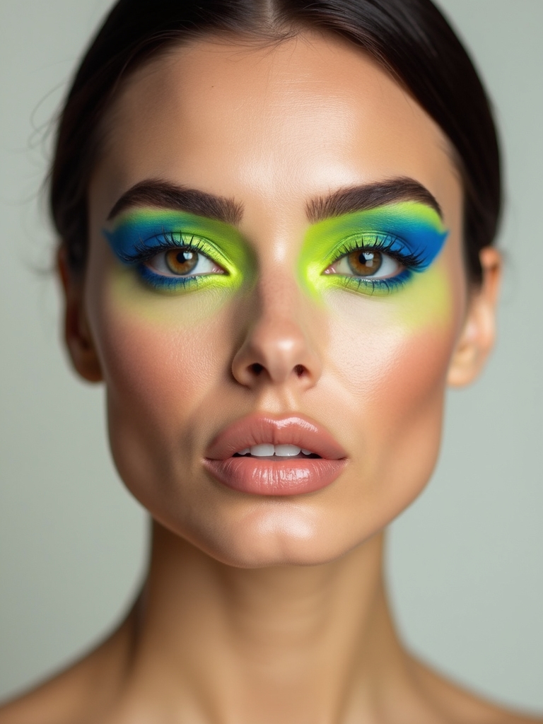
Neon on the eyes works precisely because the lip stays bare. A blazing electric lid over a soft nude mouth lets the color shout without the face feeling like a costume, and the gap in saturation is the whole trick. Build the brightness so it stays true:
- Prime the lid with a white cream base so the neon reads at full strength instead of patchy.
- Pack the brightest color onto the lid, keeping the blend tight so the edge stays crisp.
- Keep the lip nude and slightly matte, and the cheeks soft, so all the energy stays up top.
“For a jet wing on bare skin, the secret is finishing the skin before you line, then cleaning up the wing’s underside with a flat brush dipped in concealer. That one swipe carves a razor-sharp bottom edge that makes the whole line look professional.”
Monochrome Scarlet Sculpted Look
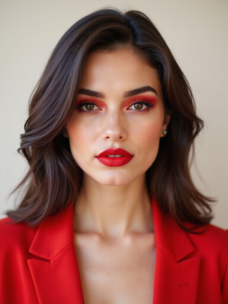
Monochrome scarlet is contrast of color against skin rather than color against color, washing one bold red across the eyes, cheeks, and lips so the whole face looks sculpted and intentional. It looks editorial and is secretly forgiving, since a single shade is hard to mismatch. I love a one-shade face for clients who panic at the idea of coordinating colors, and the red glows especially molten on deeper skin tones.
Build it tonally, light hand everywhere:
- Wash a sheer red over the lids and up into the crease, blended soft so it looks diffused.
- Echo the red on the cheeks with a cream blush and finish with a matching stained lip from the red lipstick makeup family.
- Keep the skin glowy and the brows soft so the red stays the only strong element.
Matte Skin With Glossy Lips
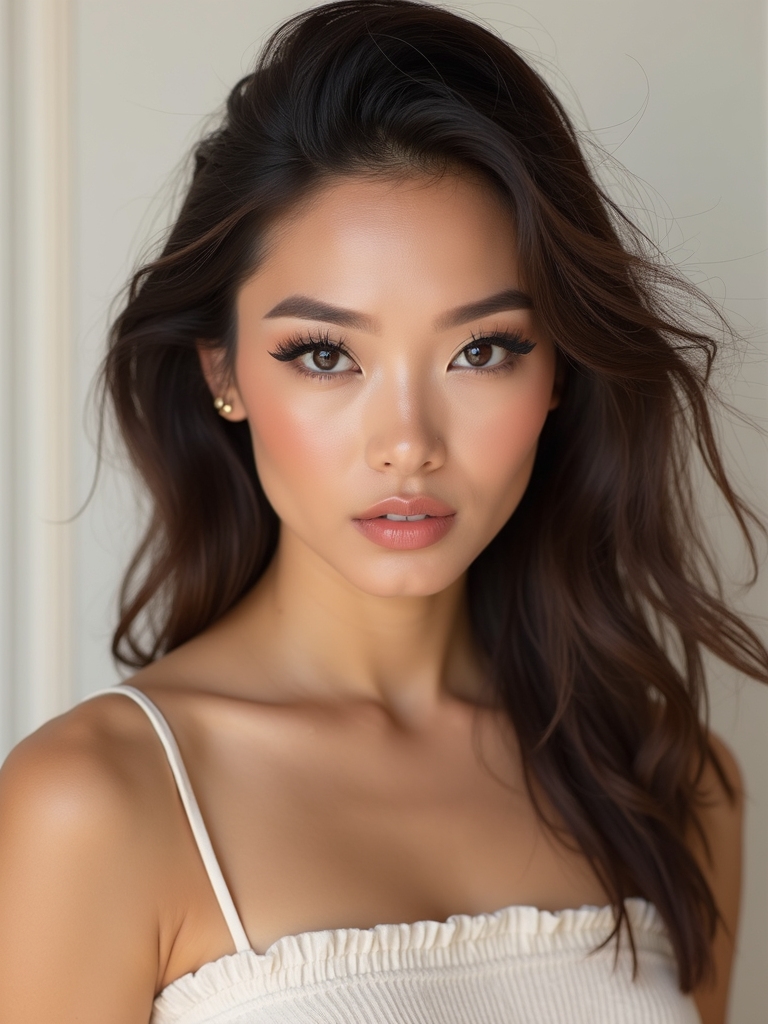
This is contrast of texture, not color, pairing a soft matte complexion with a high-shine, wet-look lip. The flat skin makes the glossy mouth look almost liquid by comparison, and the effect is quietly expensive. It is the most wearable look here and works in any shade.
Texture, Not Color
Set the skin truly matte with a light powder so it looks velvety, keeping the eyes minimal and the cheeks soft. Then build the lip in the opposite direction: a creamy base topped with a clear or tinted gloss for full wet shine. The texture gap does all the work.
Where this goes wrong is a gloss that slides, so blot and reapply, and choose a non-sticky formula. The point is shine that lasts, not a lip you cannot stop blotting all night.
| Pairing | The effect | Best for |
|---|---|---|
| Matte skin + glossy lip | Quietly expensive, modern | Everyday, work-friendly drama |
| Smoky eye + liquid-metal center | Dimensional, reflective | Evenings and photos |
Bold Floating-Crease Liner
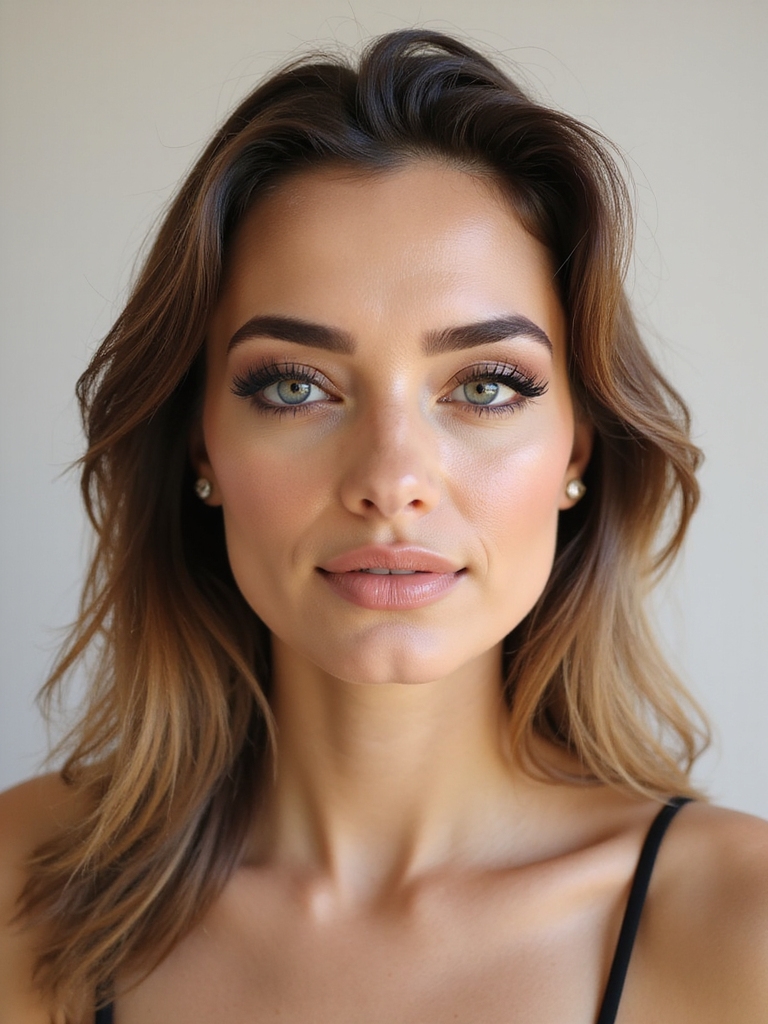
The floating crease is a graphic line drawn above the natural crease, leaving bare skin between it and the lash line. That strip of clean skin against the bold line is the contrast, and it makes the eyes look wide and modern. It is more art project than everyday, but it photographs incredibly.
Build it with patience and a steady hand:
- Map the floating line above your crease in a light pencil first, following the natural socket curve.
- Trace it bold in liner or packed shadow, keeping the lid below it clean and bright.
- Add mascara but skip lower liner, so nothing competes with the floating shape above.
Liquid-Metal Glossy Smoky Eyes
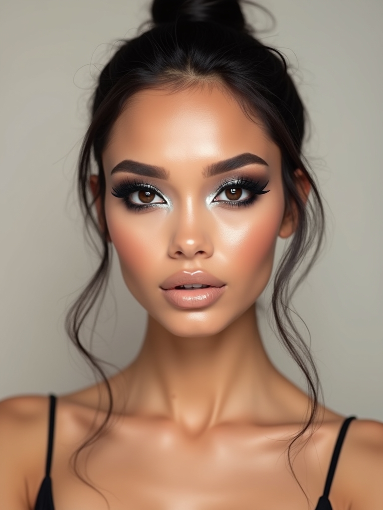
This takes a classic smoky eye and adds a high-shine metallic topper, so the depth of the smoke contrasts with a wet, reflective center. The dark, diffused edges against the liquid-metal middle give the eye real dimension. It is drama with a modern, glossy finish. The smokey eye makeup base is the foundation here.
Layer it dark first, shine last:
- Build a deep smoky base in charcoal or plum, blended soft into the socket.
- Press a foil or chrome pigment onto the center of the lid with a flat brush or fingertip for the liquid shine.
- Keep the metallic to the center only, so the dark edges still frame and deepen the eye.
Not sure which contrast look fits you? Match your comfort level.
1I want subtle, everyday definition
Try the brown liner on pale nude or the white-waterline trick; both add contrast with almost no risk.
2I want a full statement for a night out
Go for the halo eye, color blocking, or a neon lid; they read boldest under evening light.
Pastel Cut-Crease Contrast
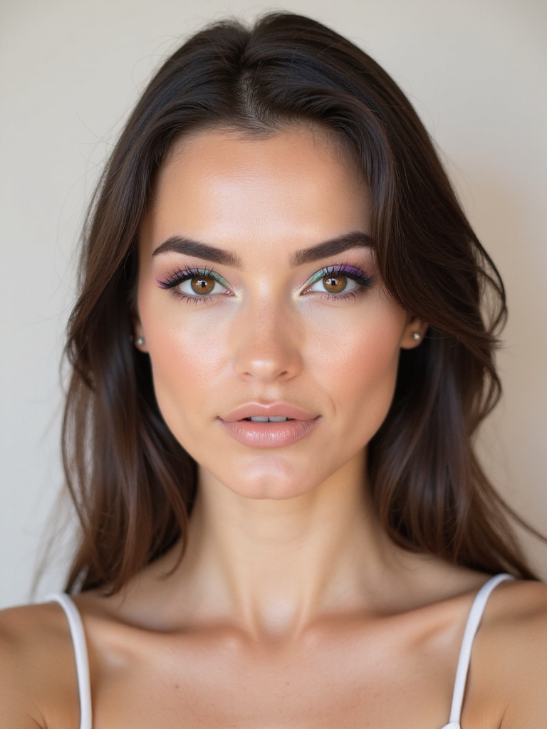
A cut crease is built on contrast: a sharp carved line separating a bright, clean lid from a deeper crease above. In pastel, the soft color keeps it sweet while the cut line keeps it crisp, a lovely balance of soft and sharp. Build the cut in this order:
- Lay a deeper shade through the crease first, then carve a clean line with concealer on a flat brush.
- Pack a bright pastel below the cut so the lid looks vivid against the carved line.
- Add a touch of shimmer to the center of the lid to catch light and define the cut further.
Sculpted Contour With Bright Highlights
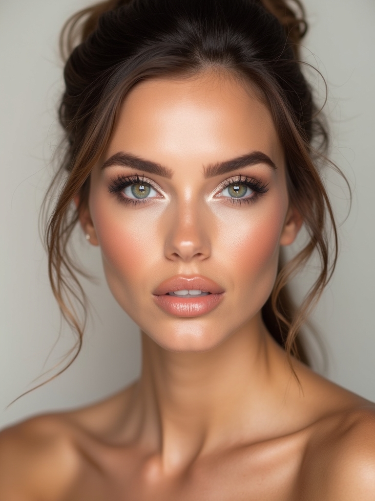
This is contrast as bone structure, playing deep contour against a bright highlight so the face looks carved and dimensional. The shadow and the light pushing against each other are what create the sculpted effect, and the deeper you commit to both, the more striking the result. It is the most universally flattering look here, and it slots easily into a soft glam makeup routine.
Balance the two extremes carefully:
- Carve a cool contour into the hollows of the cheeks, temples, and jaw for true shadow.
- Place a bright highlighter on the tops of the cheekbones, brow bone, and nose bridge for the light.
- Blend the meeting point so the transition looks like real bone, not two stripes.
Choosing how to build your contour contrast?
🎯Soft, skin-like sculpting
Use a cool cream contour and a satin highlight, blended smooth, for everyday dimension.
🎯Sharp, editorial sculpting
Use a deeper powder contour and a bright, almost wet highlight for a carved, photo-ready face.
Jewel-Toned Halo Eye
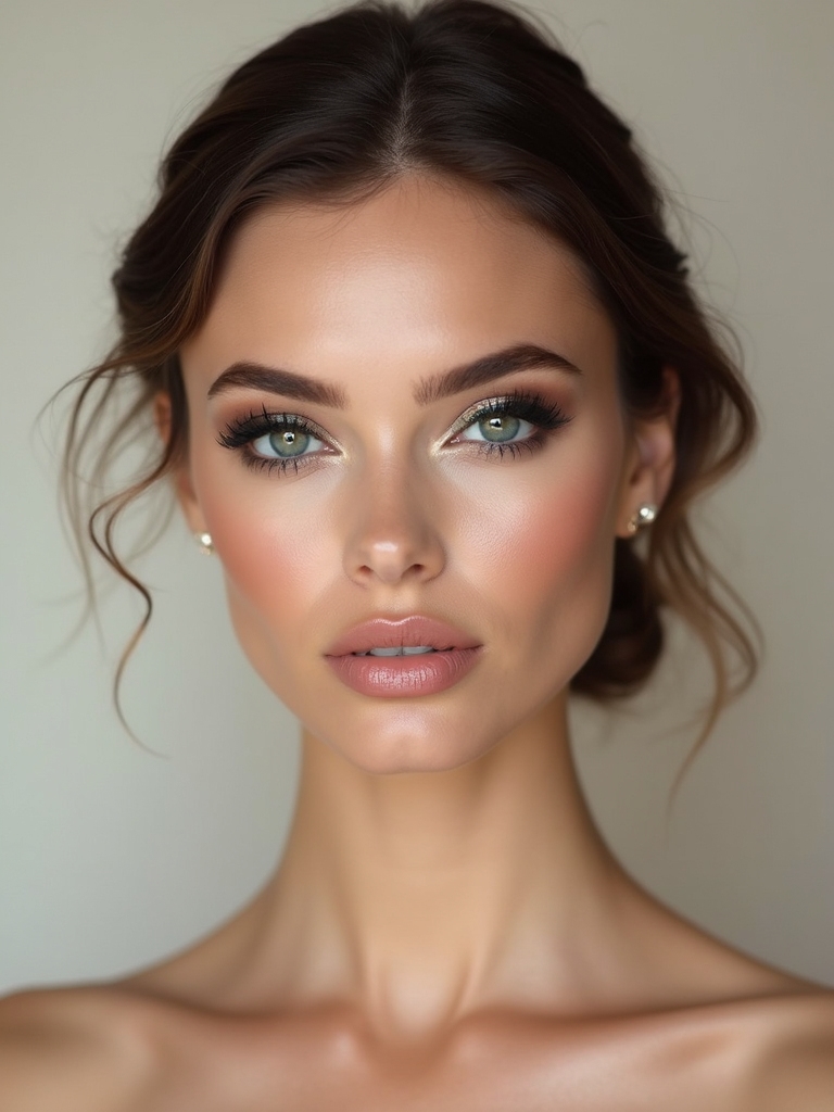
The halo eye is contrast in placement, surrounding a bright, sparkling center with a darker shade so the middle of the lid seems to glow. The dark edges make the jewel-toned center pop like a spotlight, which is why it makes any eye color look more intense. Emerald, sapphire, and amethyst all work beautifully.
Build the dark frame first, deepening the inner and outer corners with a matte shade, then press a bright metallic jewel tone onto the center of the lid and pat it on densest in the very middle. The gradient from dark to bright is the entire effect.
This look truly flatters every eye shape because the glowing center draws the eye open. On deeper skin tones the jewel shades turn especially rich, glowing against warm undertones in a way that pastels never manage.
Negative-Space Winged Liner
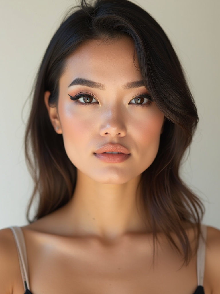
Negative-space liner leaves a deliberate gap of bare skin within the design, so the contrast is between the crisp black line and the clean skin it frames. It is a modern, graphic take on the classic wing, and it looks far harder than it is.
The bare gap is the whole point, so the cleaner you keep that exposed slice of lid, the sharper the finished eye looks. Build it slowly and resist the urge to fill the space:
- Draw a bold wing, then leave a thin slice of bare lid unlined just above the lash line, or split the wing with a gap.
- Keep the lined edges razor-crisp, since any wobble shows against the clean skin.
- Skip shadow entirely so the graphic black-and-bare contrast stays clean.
White Waterline With Smudged Charcoal
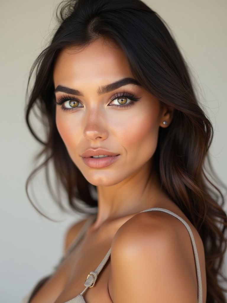
Here the contrast sits within the eye itself: a bright white waterline against a smudged, smoky charcoal lash line. The white opens and brightens the eye while the dark smoke deepens it, and the two together make the eye look bigger and more intense at once. The payoff is far bigger than the small effort it takes.
Line the lower waterline in a white or nude pencil to open the eye, then smudge a soft charcoal along the upper lash line and just under the lower lashes. Keep the charcoal diffused and a little messy so it reads smoky rather than harsh, and let the white stay clean and bright.
This is one of the easiest ways to test high contrast, since it needs only two pencils and a few minutes. It is the trick I show clients who think bold eyes are beyond them, because the payoff is huge for the effort.
Color-Blocked Complementary Lids
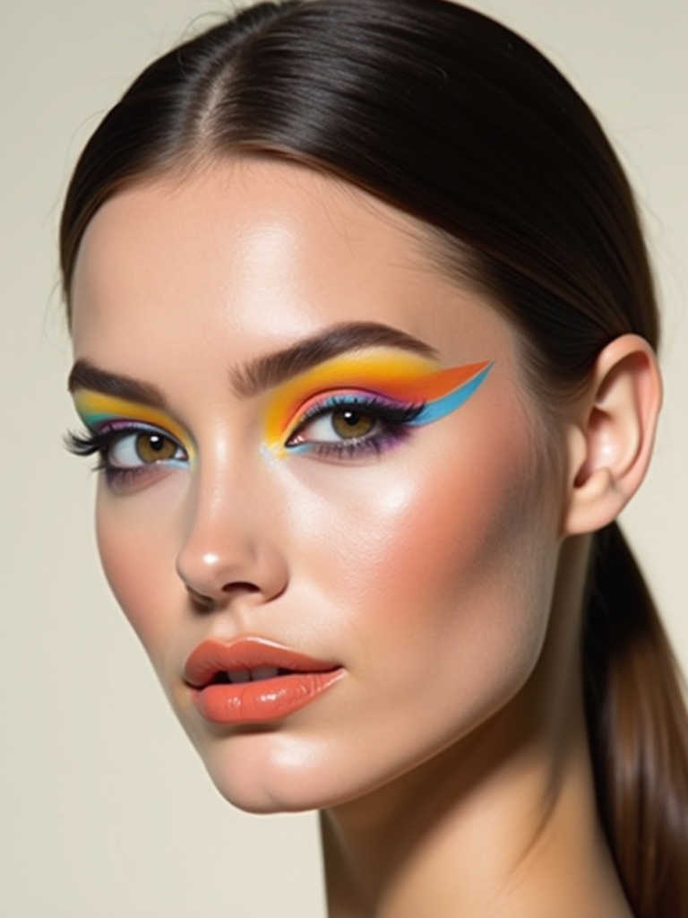
Color blocking puts two complementary shades side by side, blue against orange, purple against yellow, so each makes the other vibrate brighter. It is the boldest, most artistic look here and a real statement, but the technique is simply clean color placement. Build the blocks crisp:
- Choose two complementary colors from opposite sides of the color wheel for maximum pop.
- Block one shade on the inner half of the lid and the other on the outer, keeping the meeting line clean.
- Leave the line sharp for a graphic look, or blend just the seam for a softer color transition.
Crisp Brown Liner on Pale Nude
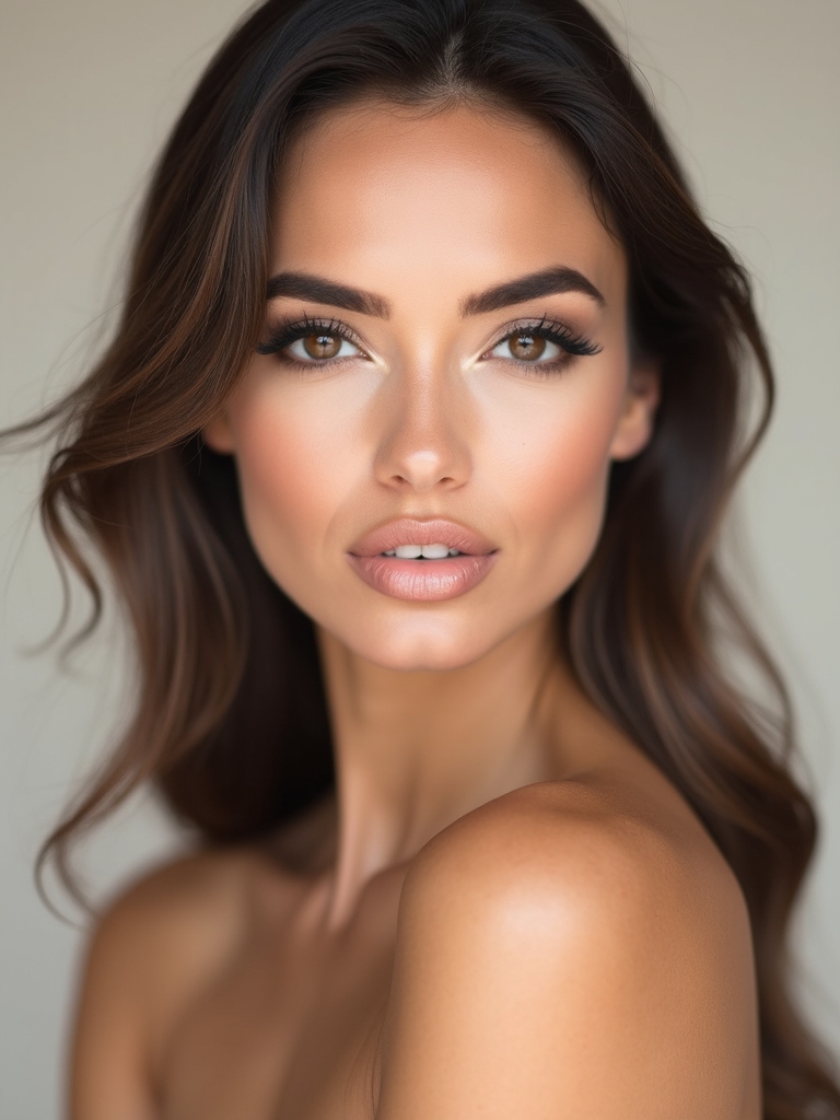
This is the gentlest contrast on the list, a crisp brown liner over a pale nude lid, proof that high contrast does not have to mean black and bright. The soft brown gives definition against the pale base without the severity of black, which makes it perfect for fair coloring or anyone wanting subtle drama over a nude makeup base. It is contrast for everyday.
Keep it clean and wearable:
- Wash a pale nude or soft beige across the whole lid as the quiet base.
- Line the upper lash line in a crisp medium brown, winging it slightly for shape.
- Add brown mascara and a nude lip so the whole look stays soft but defined.
Sunlit Base With a Midnight Wing
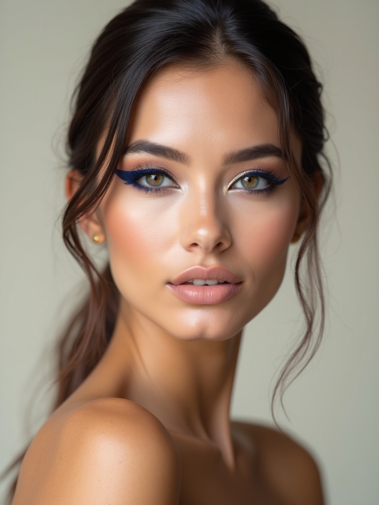
This look pairs a warm, sunlit complexion with a deep midnight-blue or black wing, so the cool dark liner pops against the golden glow beneath. The warmth of the skin and the coolness of the wing create a contrast of temperature as much as value, which feels fresh and modern. It is summer glow meets graphic edge.
Warm Skin, Cool Line
Build a luminous, bronzed base with a dewy highlighter so the skin looks lit from within, then draw a deep wing in midnight blue or soft black above it. The cool line against the warm skin is what makes both look more intentional. Keep the lip a warm nude to stay in the glow.
Reach for this when you want a bold wing in warmer months, since the sunlit base keeps it from feeling heavy. The temperature contrast does the drama so you do not need a full smoky eye.
Gilded Inner Corner With Burgundy
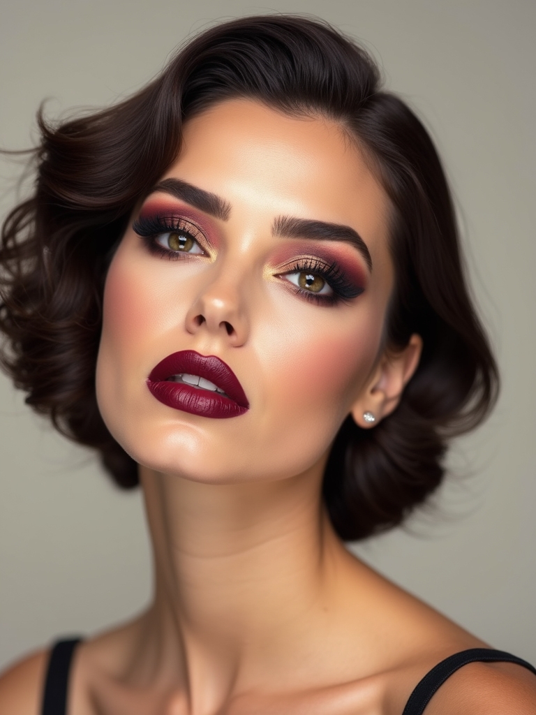
This pairs a deep, moody burgundy eye with a bright gold inner corner, so the metallic gold lights up against the rich dark shade like a spark in shadow. The warm gold and the deep berry are a classic contrast that flatters nearly everyone, and it is the eye clients ask me for most once the weather turns cold. Build the depth, then the spark:
- Build a deep burgundy through the crease and outer corner, blended soft and smoky.
- Press a bright gold metallic into the inner corner and the center of the lid for the lit-from-within glow.
- Smudge a little burgundy along the lower lash line and keep the lip soft so the eyes lead.
How to Ask Your Artist for It
If you are booking a makeup artist, the word contrast does a lot of work, but pair it with specifics so you land the right version. Say whether you want contrast of color (a bright lid on a bare lip), value (dark against pale), or texture (matte skin, glossy lip), since those are very different faces. Bring a clear reference photo and name the one element you want to be the star, the wing, the lip, the halo, so everything else can be built to support it.
Talk through your features and the occasion too. A good artist will adjust the intensity to your coloring and to whether you are shooting photos or going to dinner, since a look that looks perfect on camera can feel loud in person. Ask which pairing flatters your eye shape and skin tone, and mention if you want it to last a long night so they can set the bold elements properly. The clearer you are about which part should shout, the sharper the result.
High Contrast Makeup Questions, Answered
?Is high contrast makeup only for special occasions?
Not at all. Texture pairings like matte skin with a glossy lip, or a crisp brown liner on a nude eye, give you contrast that reads polished at the office. Save the neon lids and color blocking for nights out.
?How do I pick contrast colors that flatter me?
Lean on your natural coloring: jewel tones and warm metallics glow on deep skin tones, cool charcoals and clean brights suit fair skin, and a defined lip or liner builds contrast on softer coloring. When in doubt, dark-against-pale value contrast flatters nearly everyone.
?What is the easiest high contrast look for a beginner?
The white waterline with smudged charcoal, or a soft brown liner on a pale nude lid. Both need only a couple of products and a few minutes, and they teach the principle before you try bolder color.
?Why does my bold makeup look harsh instead of striking?
Usually because too many elements are competing or the bold color has hard edges. Keep one focal point, soften the edges that should be soft, and quiet everything else, and the same contrast looks chic rather than severe.
Make One Thing Shout
The thread running through every look here is simple: let one element be loud and keep everything around it quiet, and the bold part reads even bolder. Whether that loud thing is a jet wing, a neon lid, a wet lip, or a glowing halo, the contrast is what turns a nice face into a striking one. You do not need all fifteen; you need the one pairing that suits your features and the night you are dressing for.
Start with the gentlest version that appeals to you, the brown liner, the matte-and-gloss, and work up to the bolder pairings as your confidence grows. Set the bold elements well, keep the supporting cast soft, and have fun seeing how much drama a single sharp contrast can carry.
Keep the Inspiration Going